Copy link
Dashboard
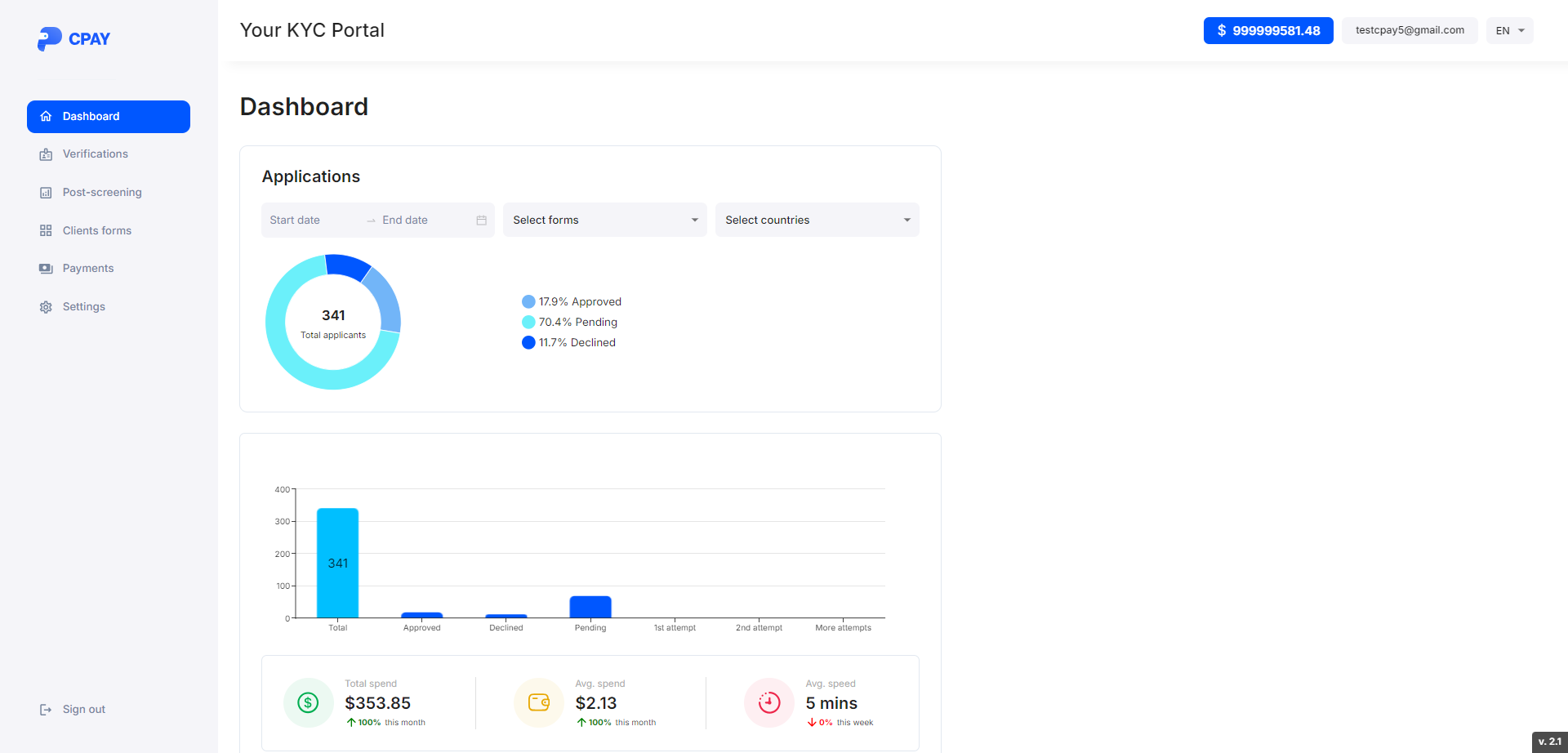
Here’s the dashboard page:

The pie chart shows the total number of applicants for a customer, as well as their percentage by status. It is possible to filter applicants by date, KYC forms and applicants' countries.
The histogram shows the same values, as well as the percentage out of 100 where more than one, more than two or more attempts were made to pass the KYC form.
Total spend - the total amount of money spent on completing forms by applicants over the entire period.
Avg. spend - average cost of completing the form.
Avg. speed - average time taken by an applicant to complete the KYC form.
The percentages below the fields change depending on the values of the previous month.